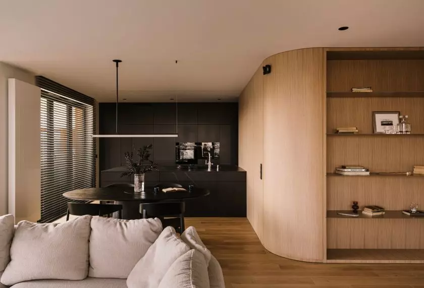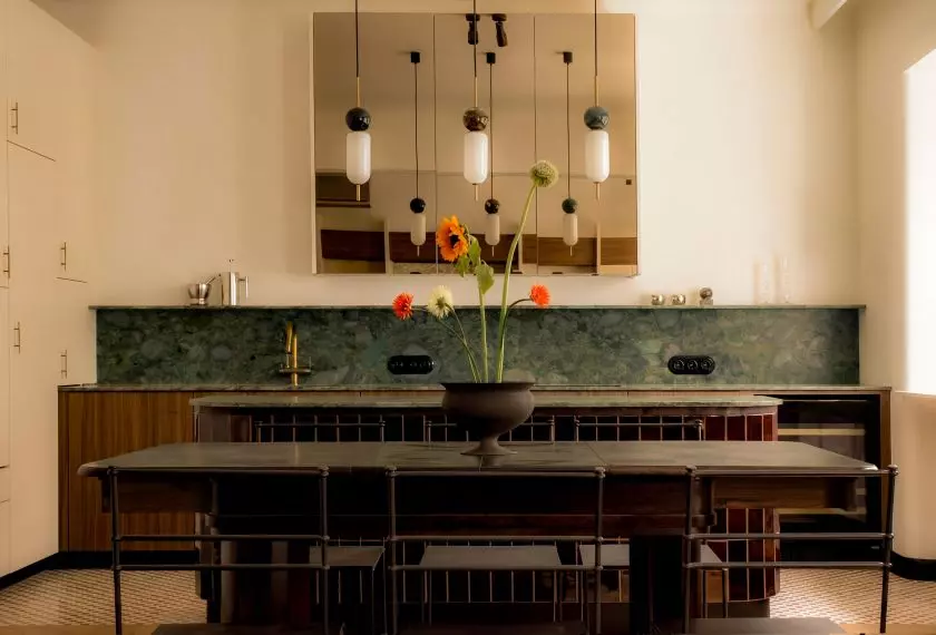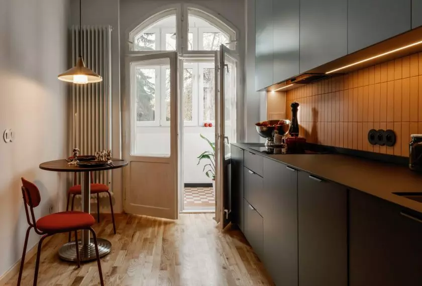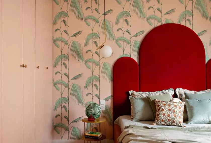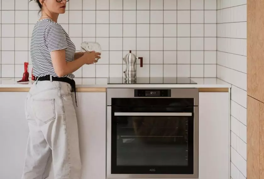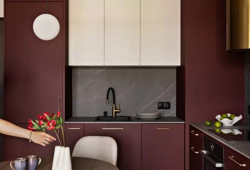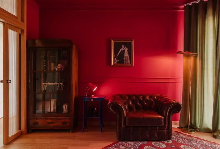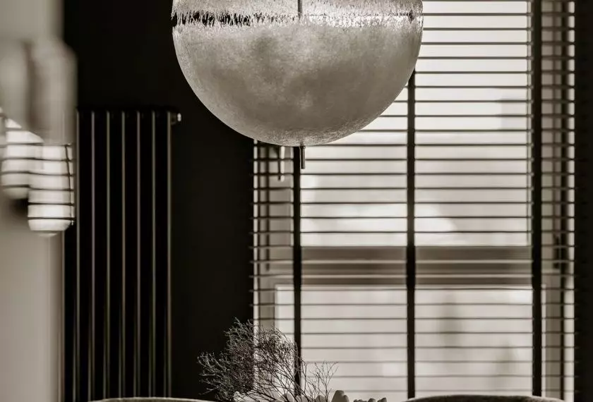


How can you create a colorful interior that remains bright, serene, and comfortable to live in? In a 90-meter segment in Grodzisk Mazowiecki, the answer was a deliberate combination of muted colors, striking forms, and objects with character. A home designed by Faro for a young married couple who work entirely remotely. The interior had to function well not only after work hours, but throughout the entire day.
From pastels to bold red
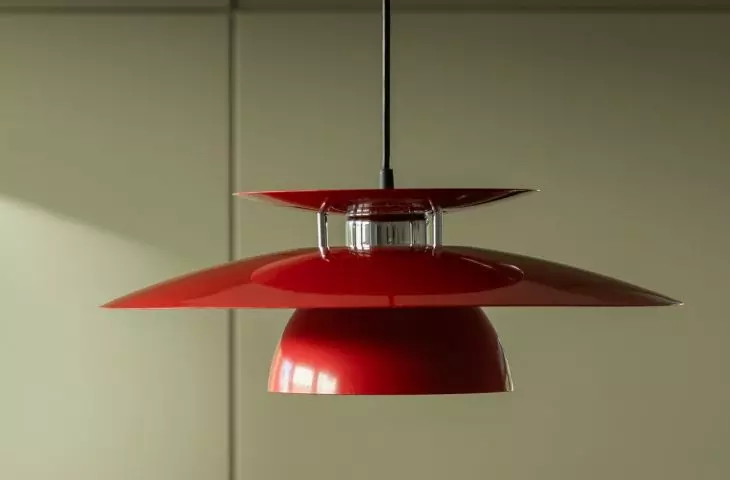
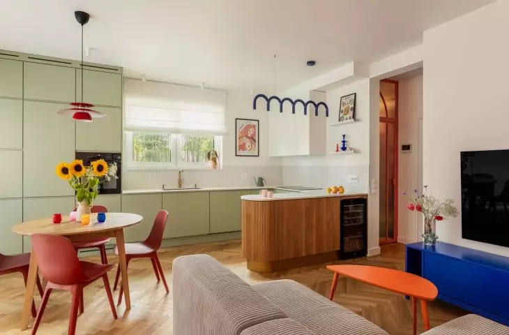
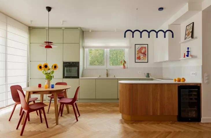
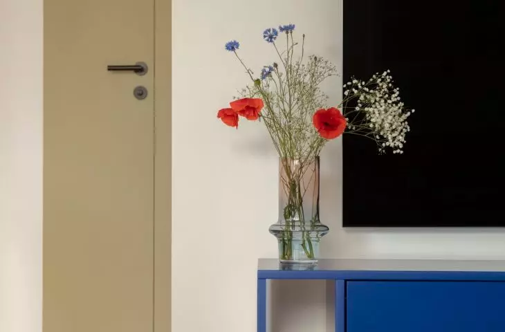
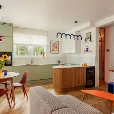
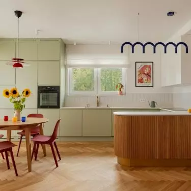
The design is based on a light, neutral palette, against which colors of varying intensity stand out. The green of the kitchen cabinet fronts, the deep green of the bathroom tiles, the cobalt-blue TV cabinet, the orange accents, and the red of the lamp above the table create an interior that’s expressive but not garish. Color isn’t treated merely as decoration — it helps define zones, highlight specific furnishings, and establish the rhythm of the entire space.
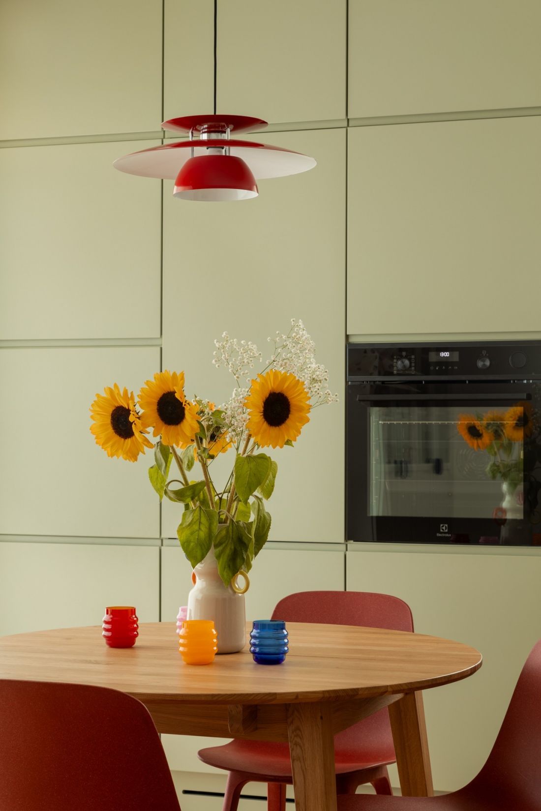
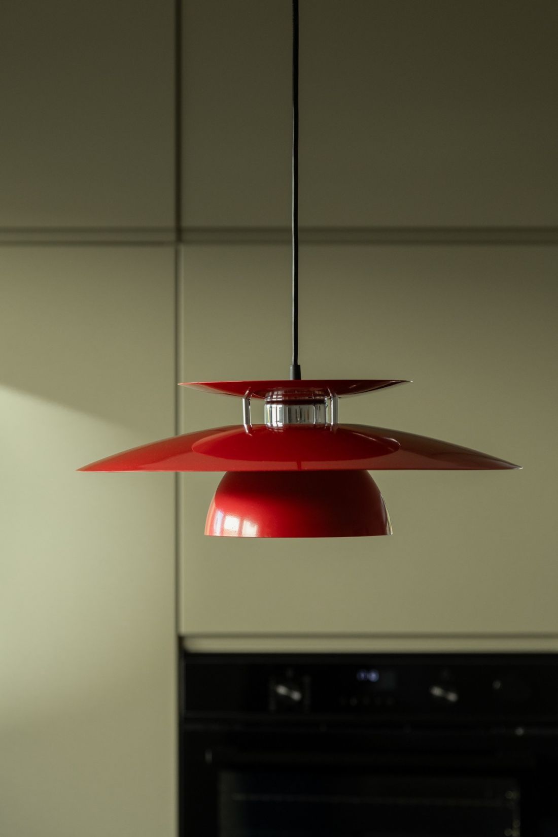
The color palette chosen for the design is full of vitality.
Photo: Mateusz Kowalik
There’s something optimistic about this kitchen
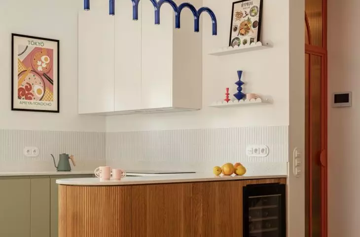
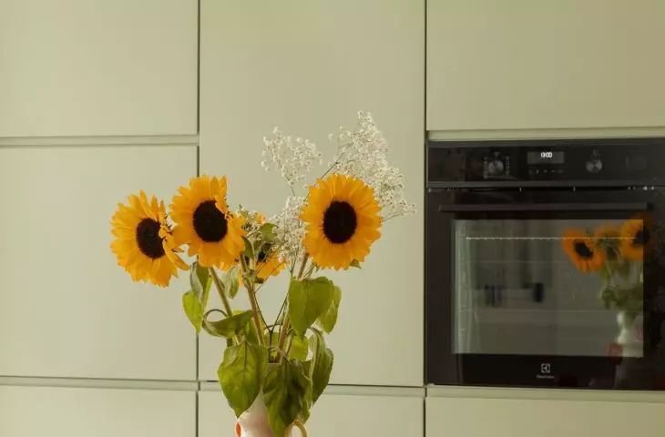
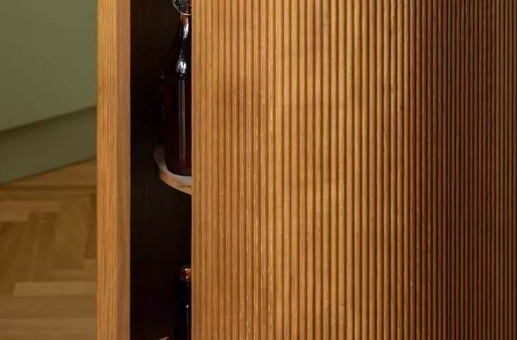
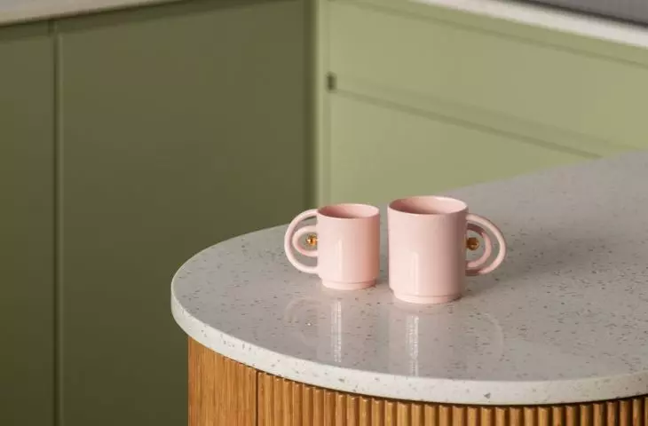
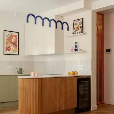
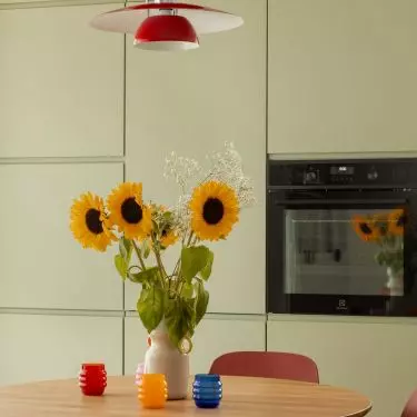
The kitchen draws attention with its fresh, pastel palette. The light green of the cabinet fronts, warm wood, and white create a light, inviting backdrop, enlivened by red chairs, a retro lamp, and small accessories in bold colors. As a result, the interior is colorful but doesn’t feel overwhelming — rather, it evokes energy, sunshine, and everyday freedom. The focal point is a wooden island with a distinctive grooved front. Its rounded edges blend smoothly into the living room space, and the recurring motif of curves gives the kitchen a softer, almost furniture-like character. The light-colored countertop further emphasizes its airy form.
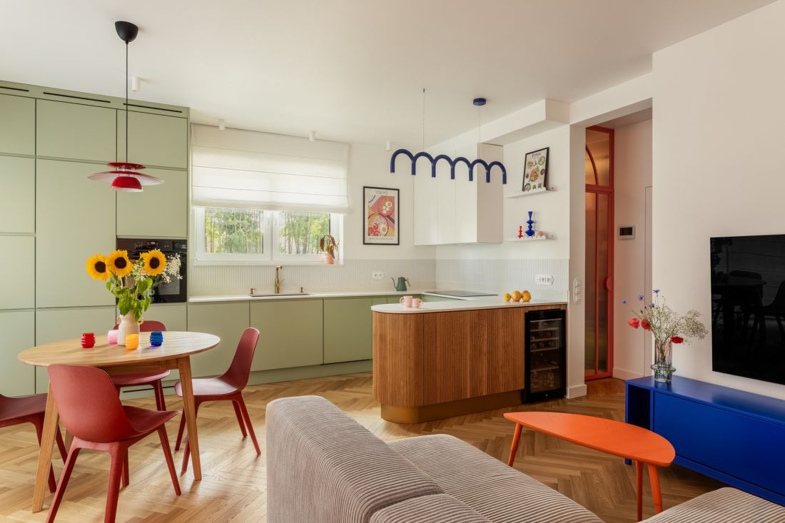
Vibrant green, red, orange, and cobalt.
Photo: Mateusz Kowalik
Lego, IKEA, and vintage
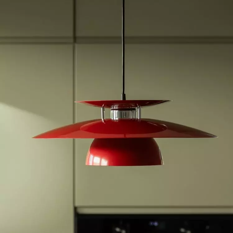
One of the project’s goals was to incorporate items the clients already owned. A red vintage lamp, LEGO sets, and an orange side table from a limited-edition IKEA collection were not treated as elements to be hidden from the new design. On the contrary — they became part of the concept. It is precisely these personal items that prevent the interior from looking like it’s made up solely of catalog items. Alongside custom-designed built-ins and new furniture, there are items connected to the owners and their interests.
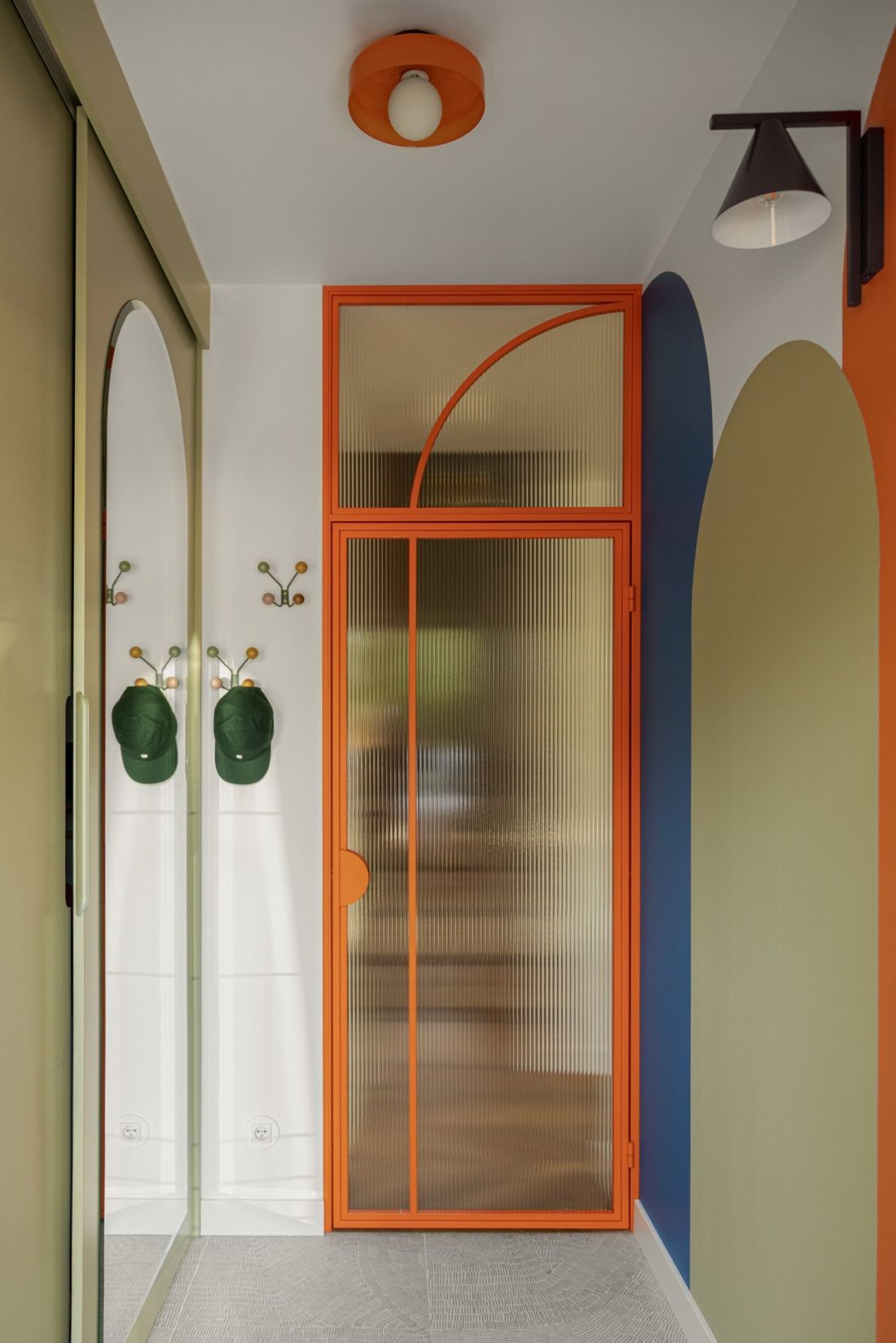
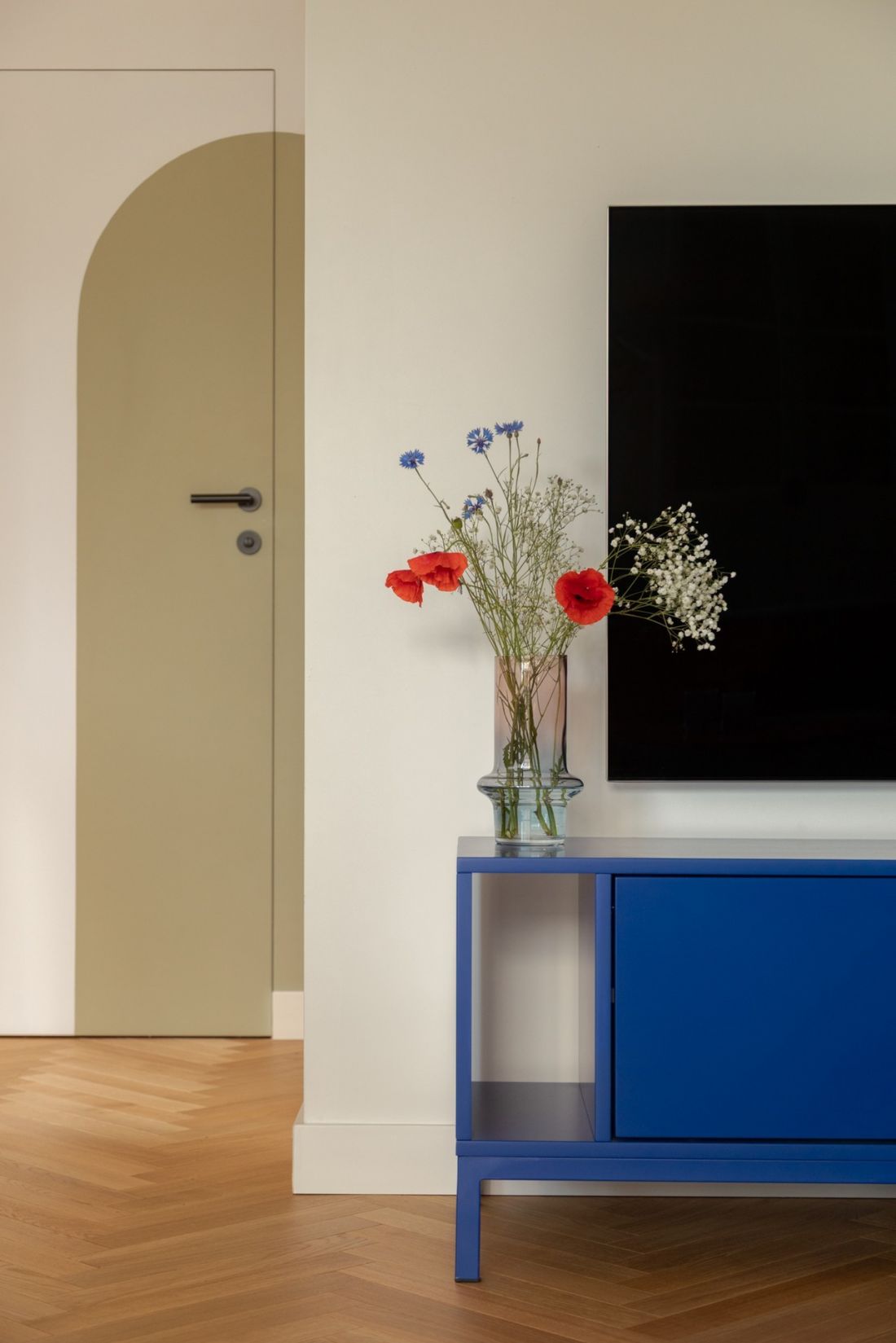
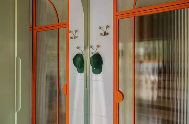
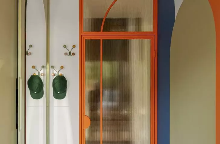
The custom-designed door frames echo the arch motif.
Photo: Mateusz Kowalik
Bathrooms in Two Styles
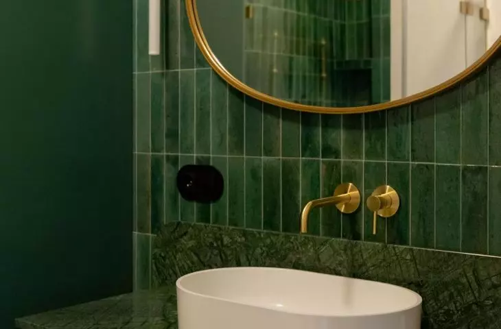
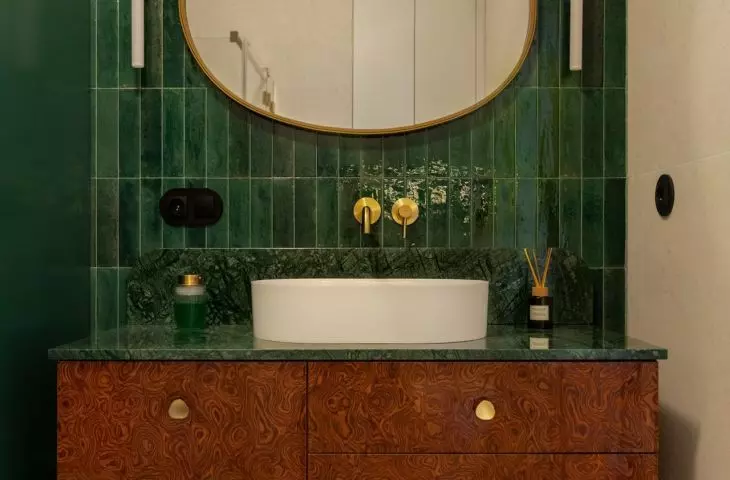
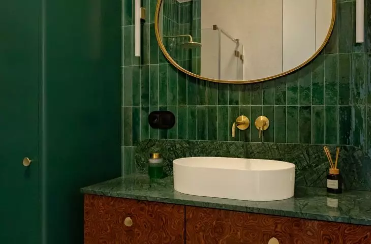
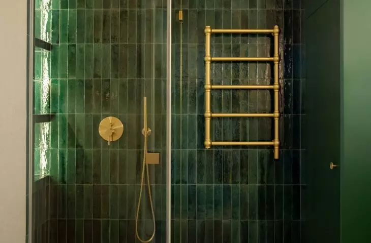
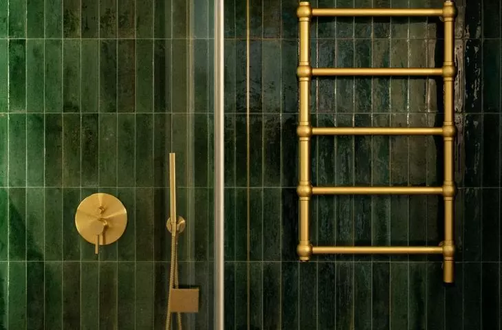
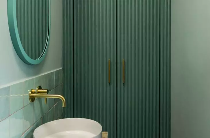
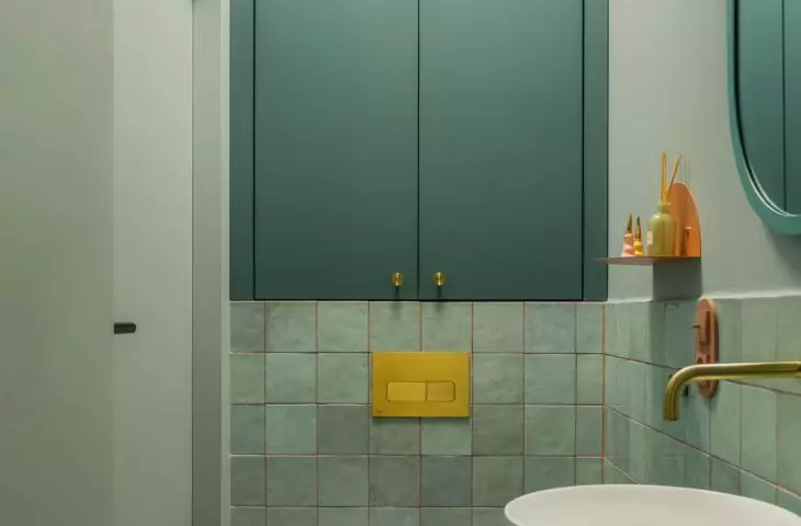
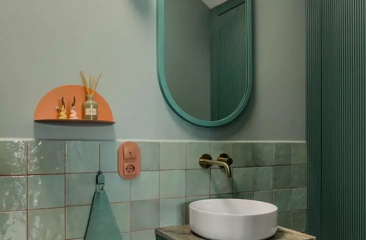
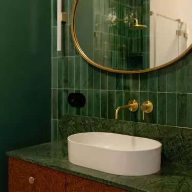
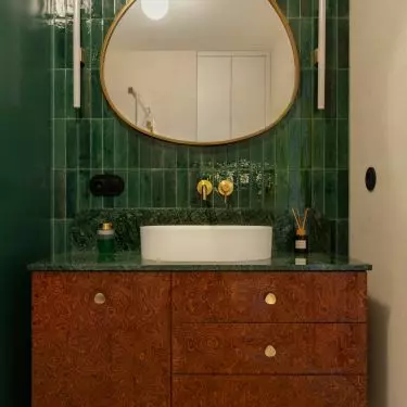
In the bathrooms, color was used even more boldly. One of them is dominated by a deep, saturated green. Shiny, narrow tiles laid vertically provide a backdrop for the gold fixtures — the faucet, shower, and radiator. The contrast between the dark green and gold gives the interior a more elegant, almost jewel-like character. In the second bathroom, the color palette is much lighter. Mint-green tiles with contrasting grout are paired with green cabinetry, a wooden countertop, and terracotta- and gold-colored accents. Another distinctive feature is the mirror with its soft, rounded shape. Here, color appears in many places, but thanks to the repetition of hues, the overall look remains cohesive.
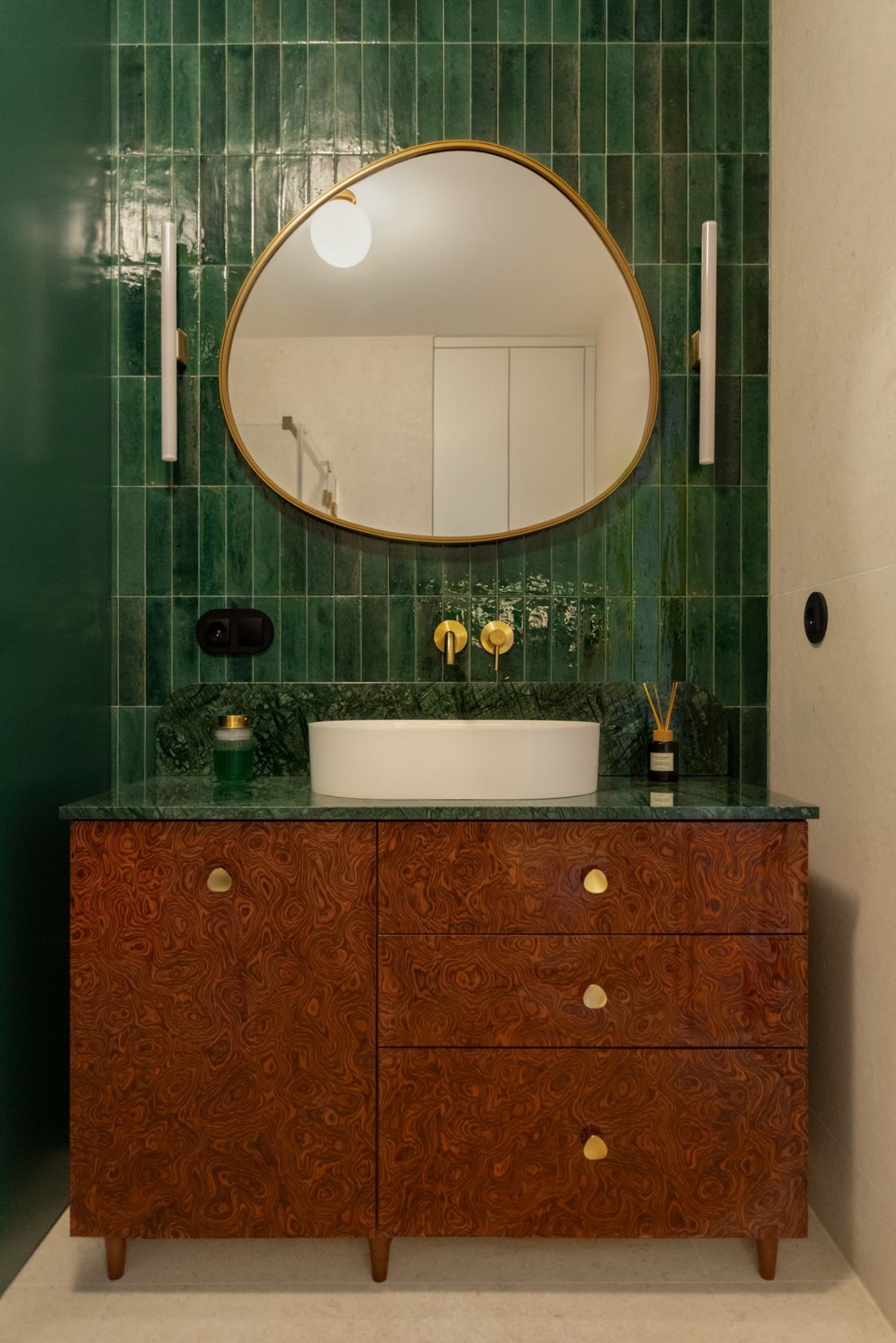
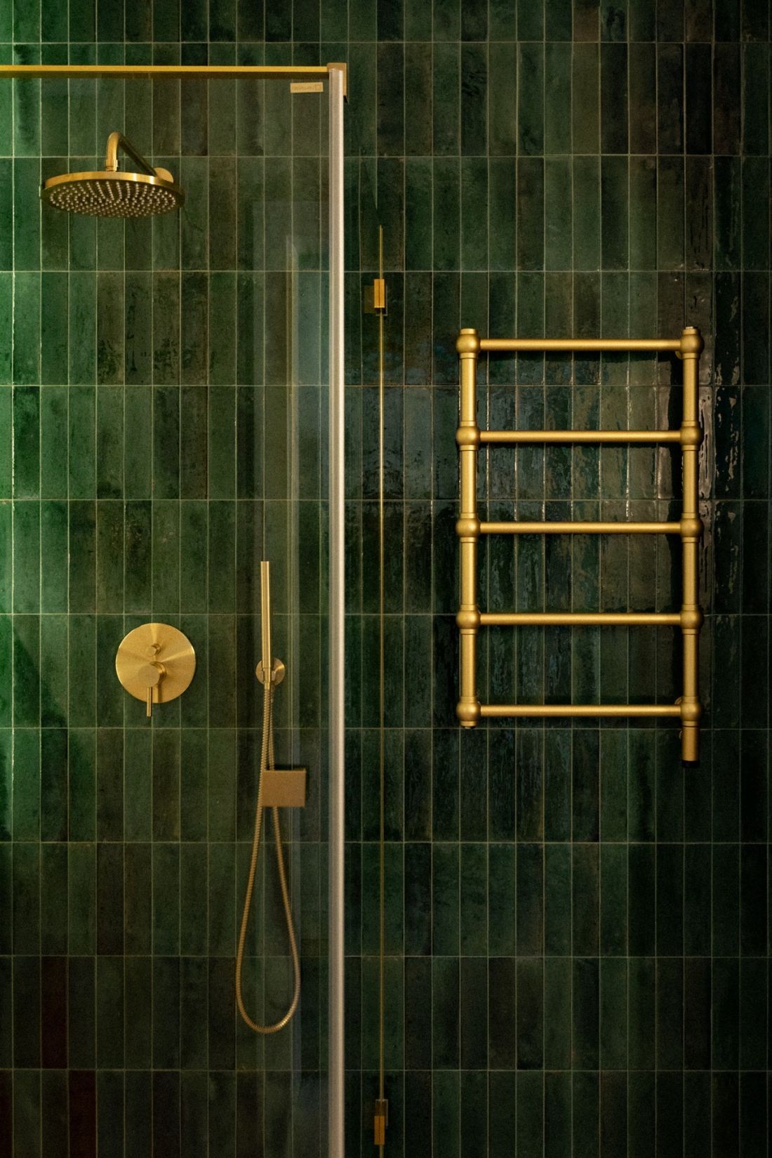
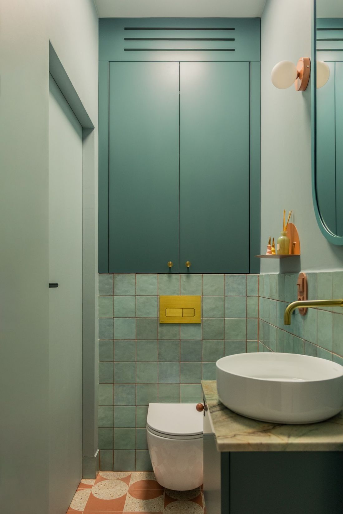
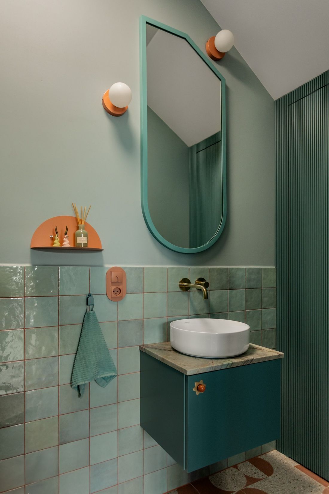
Both bathrooms are full of color, yet each is completely different
Photo: Mateusz Kowalik
The “sunny” bedroom
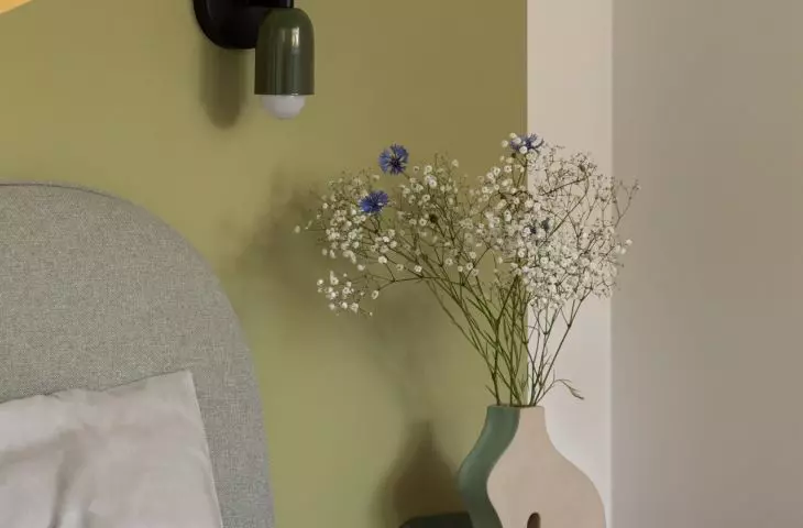
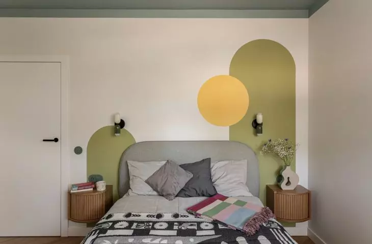
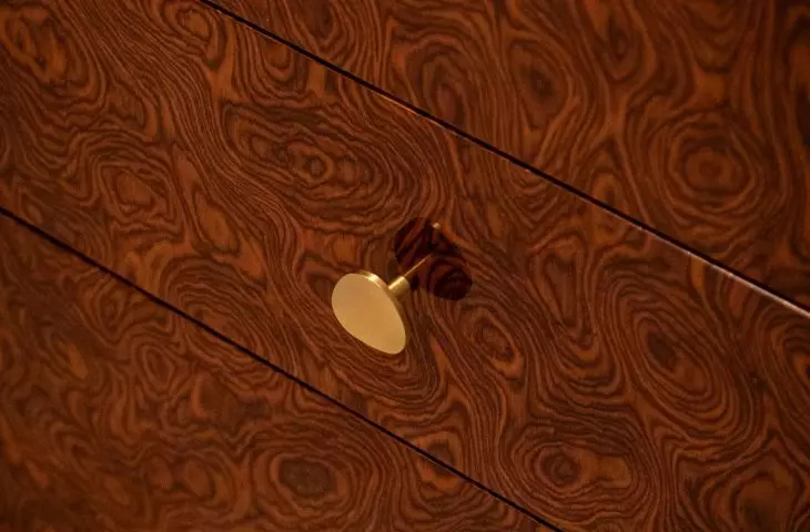
In the bedroom, the intensity of the colors is used for accents. On the wall behind the bed, olive and mustard-colored shapes with soft, rounded contours appear. The yellow circle brings to mind the sun, and together with the green paintings, it serves as a decorative backdrop for the soft upholstered bed and wooden nightstands. It is precisely these rounded shapes that are one of the recurring motifs of the design. They can be seen in the shapes of the furniture, mirrors, and kitchen island, as well as in the details of the woodwork. The rounded shapes themselves lend a sense of softness and make the interior feel more gentle.
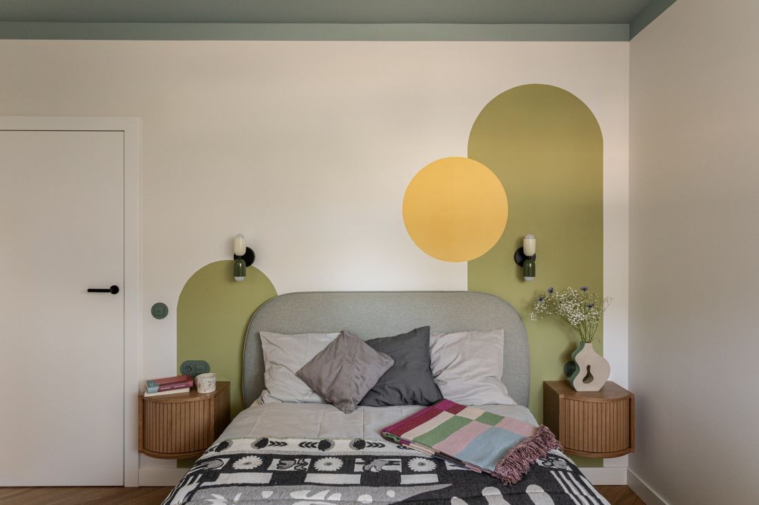
The geometric shapes on the wall behind the bed complement the rounded headboard well.
Photo: Mateusz Kowalik
Color, First and Foremost, for the Residents
Although the home features many colors, patterns, and bold accents, they have all been thoughtfully combined, ensuring the interior remains cohesive and airy. The light-colored base allows individual colors to stand out, while recurring shapes and materials help maintain visual order. This interior was designed for the people who actually live here — who work, relax, cook, collect objects, and surround themselves with things they love. Instead of confining the home to a single style, the design uses color, form, and detail as tools to create a personal space that is light and full of energy.